Black Friday and Cyber Monday are the sort of holidays that make me want to lock myself in my room all weekend and ignore the outside world – while blasting Christmas music, of course! But late Cyber Monday evening it occurred to me that actually, there was something I had been meaning to buy for a while – a new website theme (which, for any of you non-bloggers out there, is sort of like a website design template).
The last time I redesigned my blog was about two years ago, when I bought a new theme on a whim and spent a weekend customizing it by Googling bits of code. It was totally impulsive and I didn’t put a great deal of thought into it, but I told myself I would fix it up properly when I had more time.
Fast forward two years and this blog had become my full-time job, yet I still hadn’t made any changes to the design! Professional bloggers usually take months, not weeks, and certainly not a weekend, to work on website redesigns, so it was definitely time for me to put more thought into my site and make it look more professional.
And so of course I chose a new theme on Etsy in about 20 minutes (Cyber Monday was almost over, I had to rush!) and then spent a week customizing it myself with the help of Google. And then I redid my header image in Gimp while watching an Arsenal game on tv with Dan.
Aaah will I never learn?
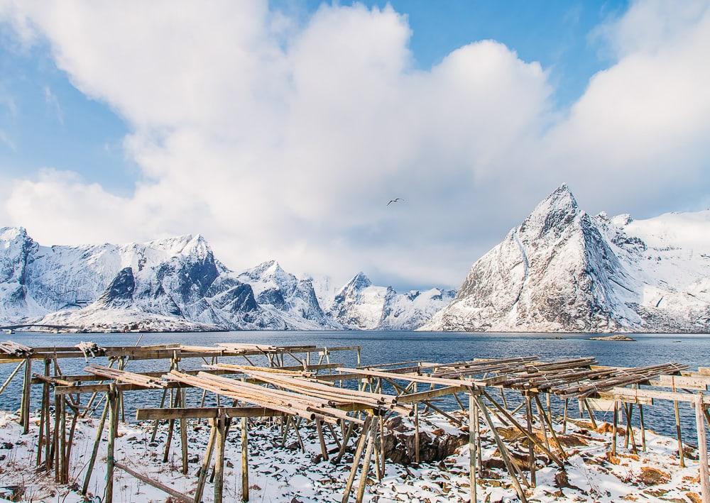
I am quite pleased with the new design though, and I really hope you guys like it too. And bonus points to anyone who knows where the mountains in my header are from!

Here’s a hint:

I’m still catching some things that need tweaking, so if you see anything that looks off definitely let me know!


Tosh Bene says
LOVE the new design. Looks amazing! Ummm, could those mountains be from the Lofoten area? If I’m wrong I’m going to be pretty upset, since I’m like obsessed with Lofoten!! LOL Good job on the site, girlie!!=)
Silvia says
Yesss Lofoten! And thanks, I’m so happy you like it!
Nynke says
I love the new theme! It took me a few seconds to get used to the new headline font (so thin, and there’s so much white around it on my large PC screen), but it definitely works. I’m not sure if your header (with, surely, some mountain called whatsit-tinden in Lofoten) doesn’t look a little too small , or rather, narrow, for a PC screen… But I’m not sure if you can do different ones for PCs and mobile devices?
Silvia says
I agree about the headline font – I made it thicker, so hopefully now it’s easier to read. And yeah, the header has to be small to fit small screens as well, though I can see how it looks if I make it a bit bigger. Thanks for sharing your thoughts!
Rosie says
Your new blog theme looks great, I love the homepage – especially the ‘choose a country’ section, that’s seriously cool. I wanna say the mountains are somewhere in Lofoten?
Silvia says
Yes, they’re in Lofoten!
Vanessa Brune says
Congrats on the new theme – I love it!! Part of the reason why I’m not part of the WP crew anymore is that I can design my site myself, whenever I want – however, it’s soooo tempting to redesign it every other week and so hard to resist 😀
Silvia says
Oh my goodness, that would be so dangerous for me! haha
Emily says
I love the new look! Your header turned out great.
Silvia says
Thanks, happy to hear you like it!
Caroline says
Looks awesome! The mint green navbar gives me all the peaceful feels 🙂
Silvia says
Yaaay I was hoping it would!
taylor says
Good luck & happy christmas
Jim says
Good job!
Thank you for sharing